


The Brief
Defining an epilepsy research leader
CURE Epilepsy, founded by parents seeking answers about epilepsy, is the leading nongovernmental funder of epilepsy research in the U.S. Since 1998, it has awarded over $90 million in grants.
CURE enlisted Statement to create its first-ever impact report to more effectively showcase its work and engage donors. Since epilepsy is extraordinarily complex and the road to a cure is long, these families needed to see that their donations were making a difference now. Our aim for the piece was to weave the scientific and human elements of its work into a compelling brand story, highlighting the urgency of finding a cure for this relentless disease.
CURE soon expanded the partnership with Statement to include a refresh of its brand and logo. Statement continues to partner with CURE on its impact report, which serves as a foundation for its communications as well as a major driver of revenue.

Impact Report
Making Research Personal Through Storytelling
After leading CURE Epilepsy through a brand workshop, we developed a name for its new impact publication: RESEARCHING FOR A CURE. By knocking out the RE in a different color, we created a double meaning that captures the core belief of the organization: Research is the path to curing this devastating disease.
Since the content focused heavily on the organization’s research discoveries, our goals were two-fold: to help readers understand the long-term impact of these findings and to show why CURE Epilepsy focused its research in these areas. Each issue carries this theme forward, intertwining stories of breakthroughs and patient experiences to remind readers at every turn why CURE Epilepsy is fighting each day.

Impact People Can See and Feel
We took CURE Epilepsy's foundational brand elements and enhanced them with color and typography adjustments, alongside creation of bold graphics and patterns inspired by science. We paired these elements with human-centered photography of patients, researchers, and supporters and wove it together in collage-style layouts, emphasizing the organization’s collaborative approach in advancing research progress.
In a noisy digital landscape, CURE Epilepsy recognized the power of putting an immersive, magazine-like printed piece into people’s hands. We worked closely with CURE Epilepsy and their selected printer, developing print specifications and conducting an on-site press check to make sure each color looked as vibrant in the final piece as on our screens.
View All Reports Since 2019 >

Brand Identity Refresh
A Bold Look, Influenced by Science
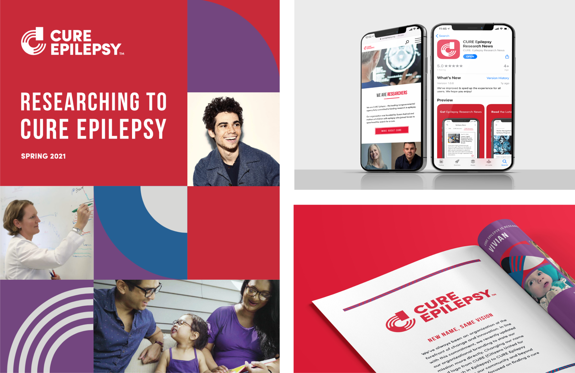
After launching the impact report, the organization approached us with the challenge to create an iconic mark that would reflect its dedication to funding and promoting patient-focused research. Originally named Citizens United for Research in Epilepsy, the nonprofit often went by the abbreviation CURE, losing the impact of having the word "epilepsy" in its name. The organization decided to rename itself CURE Epilepsy and wanted a logo that would showcase both the word and the concept of curing epilepsy.
After in-depth exploration, we arrived at our solution. The CURE Epilepsy logo is a play on a microscope, with curved lines that convey a sense of motion and advancement. Solid shapes stop the lines abruptly – a metaphor for the nonprofit's mission to end epilepsy.

25th Anniversary Report
A Special Edition for a Silver Anniversary
In 2023, CURE Epilepsy turned 25 – a major milestone that demanded a special impact publication. The first question: How do you share a quarter-century of accomplishments in a single piece? Statement worked with the organization to organize the report around three impact themes, then added eye-catching design elements to excite and inspire supporters for the next 25 years and beyond.
- A fold-out timeline takes readers on a visual journey through 25 years of organizational milestones
- Patient stories, stats and bite-sized research highlights combine to paint a picture of CURE Epilepsy’s impact as a leader, collaborator, and innovator
- Printed silver foil on the cover ties into the anniversary branding and creates a moment of delight for readers


Results
Deepening Connections With A Community of Supporters
Over the last 25 years, CURE Epilepsy has built a close-knit community of patients, families, friends, and researchers who share its vision of a world without epilepsy. CURE Epilepsy's new brand and ongoing impact reports have brought its supporters more fully into its work – helping them see the ripple effect of their actions and keeping them engaged in the relentless pursuit for a cure.


